September 11, 2013

Covergirl Hunger Games The Coal Mining District 12 Collection

Covergirl Hunger Games The Coal Mining District 12 Collection

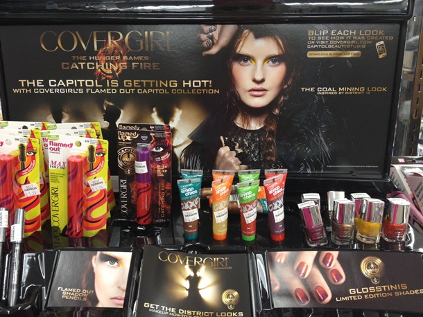
I ran across the display for the Covergirl Hunger Games The Coal Mining District 12 Collection at Harmons! This is one of the 7 displays of Covergirl Hunger Games inspired makeup that is launching for the Fall 2013 season.

As I suspected the display contained repromoted products and shades. Remember my original post where I expressed some doubt this would be a collection with special LE packaging or shades? Well, guess I was right!

Covergirl Hunger Games The Coal Mining District 12

Covergirl Hunger Games The Coal Mining District 12 Collection repromotes Covergirl Flamed Out Mascara in the old packaging as well as a special edition packaging. Also available are Covergirl Flamed Out Eyeshadow Pencils and Covergirl Flamed Out Eyeshadow Pots plus a new selection of limited edition Glosstinis Nail Polish and Covergirl Lipslicks Smoochies Sizzle Gloss (new product).

Covergirl Hunger Games The Coal Mining District 12 Eyeshadow

Covergirl Hunger Games The Coal Mining District 12 Glosstinis Nail Polish

Covergirl Hunger Games The Coal Mining District 12 Lipgloss

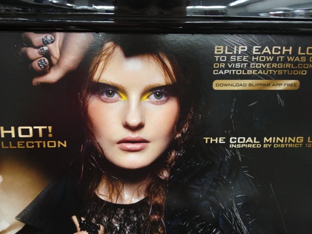
For some reason the display looks rather wicked with the promotional image and the looks they created on the model however, the Covergirl Lipslicks Smoochies Sizzle Gloss and old style Covergirl Flamed Out Mascara packaging brings it down a level and makes things look a little unbalanced. I’m wondering if this is how Covergirl intended the display to look or if someone working at Harmons set it up incorrectly?

A booklet located below the display gives a small blurb of the look that states, “Dab color on with the finger for a smoky effect using Charcoal Shadow Pot from the inside to the middle of the lid and a Molten Black Shadow Pot on the outside lid and under the brown and finish with Flamed Out Mascara.”

As a fan of the books and the films I’m personally disappointed and I think others will feel the same. I suspected this would be a launching pad for the Flamed Out Shadow Pencils and Pots. They want to recreate a buzz for these products as it is back to school and teenagers can related to the YA novel and films plus Flamed Out are a makeup product for a younger demographic thus this is the perfect way to recreate a buzz up on these products.

However, fans of the books and movies will likely be disappointed.

I’m looking forward to seeing the other displays Covergirl has planned. So far the Hunger Games The Coal Mining District 12 Collection is disappointing to me!

Thoughts?

Do share!

About the Muse

Isabella MuseIsabella is just an average everyday geeky girl who doesn’t blend her eyeshadow correctly, wears too much blush, and hopes she never finds her holy grail products because she likes the thrill of the chase so much. Her mission is to bring you super honest reviews on makeup, skincare, fragrance and all things beauty. She’s in no way an expert on the topic and she sure as hell isn’t a super model. But she’s passionate about makeup and is seeking like-minded individuals that like pina coladas, getting caught in the rain, and ones that enjoy spending hundreds of dollars at Sephora without feeling buyer’s remorse. If you’re that person feel free to reach out and leave a comment or follow me on Facebook, Instagram, Twitter, and Bloglovin‘.

Leave a Comment

This site uses Akismet to reduce spam. Learn how your comment data is processed.

Comments

  • Michelle

    If this is all that CG has in store for this “collection”, all I can say is what a letdown! I was really hoping for some LE movie inspired makeup as if they really did research as to what the books are all about and wanted to help people bring the characters or the ideas to life. This looks like a gimmick and a sad, pathetic one at that. Here’s to hoping that the displays get better and this one was just one that wasn’t very well thought out.

    • the Muse

      I was too, I was too but I SUSPECTED this it what they were doing…! I kinda knew they’d start repimping out Flamed Out products as soon as I seen the first promo images! :-/ damn…!

  • Meganlisa

    I’m so disappointed! When I told my daughter – who loves the book and movie along with all her friends – she thought the collection was a great idea. But this!? What is this? Have they not heard of…let’s suggest Urban Decay and the Oz collection? Now, that was lovely. This mess…is a hard sell (what do I sell my daughter and her friends…basically nothing that’s really Hunger Games). Thanks for the update! I won’t waste my time looking for the collection.

  • Laurie

    Meh, no thanks. I don’t even see any shadows or colorful eye pencils so how do they expect anyone to recreate their promo pic looks? Looks to me like they’re just trying to cash in on the popularity of the Hunger Games and threw it all together.

    • Malinda Jane

      That was my thought! Did they even use covergirl for the promo looks? I mean, there’s no way.

    • kishan

      covergirl did not create the looks kryolan did and that is the only way you can re-create
      those Hollywood movie looks They have everybody chasing the dragon buying expensive make up like mac and inexpensive cover girl they are rich selling you crap when they are not using that stuff ,they cant use regular makeup in movie and tv and red carpets do some research, by the way that lip gloss is kryolan you wont get those kind of glossy lips with cover girl or mac.
      Everything is kryolan for these looks

  • devon

    that is exactly how my harmon’s had it set up too…i think that’s how CG intended. was tempted to try the glosses but i bet they’re just sheer with slit sparkle, but the nail polishes might be nice!

  • Michou

    I am so so tired of companies glamorizing the “coal mine” aspect. First of all, that job takes lives both in the books and in real life. I can’t help but feel a bit of irony that the industry is acting as badly as the Capital does when it comes to promoting the film/books. (The industry effusively promotes the romantic relationships, the “grunge chic” of the oppressed, etc). I just can’t help but shake my head when I see these makeup inspired lines.

  • Malinda Jane

    I knew covergirl would disappoint on this. I wish they’d done this with Urban Decay. Heck, even Revlon or Maybelline would’ve turned out something much better than this. They probably would’ve even made products SPECIFICALLY for the collection. I figured the promo images for this would be the best part of it, and I was right.

  • tracy k

    they couldn’t have at least done some special sleek packaging…i mean come on. and there is NO WAY that vibrant yellow eye came from that lame gold eye pencil…

    • Annette

      oh man i know!! I was so excited to see the bright yellow color, I would have hoped they came out with eye shadow palettes at the least (ie the L’Oreal’s Project Runway) I am and have been wondering how to re-create their promo looks, seriously you cant do that with shadow sticks….

      I saw over on the capitol beauty studio site the lists they “SAY” were used, I have an issue with this because in the Luxury look, it said the lip was done with the CG lip perfection in HOT, first off this color is not the dark Burgundy they show in the pics, HOT is a bright red with a blue undertone. Its the same color Taylor swift wore in her campaign. I think all the colors that made up the promo pics are not even the ones for sale. My guess is they contacted a professional to do the photos and then guessed what could be used to recreate it for the mass consumer. I really wish they would have put out the actual colors….I guess I will have to go to MAC and Sephora and buy shades to recreate it on my own! So disappointed.

  • Lulle

    I understand how you feel about this collection! I’m curious about the glosses though and I’m pretty sure I’ll get one (or two).

  • Julia

    Covergirl’s collection is a complete let-down. The packaging could have been a bit more dark and metallic to reflect the colours in the film & books. There’s nothing special about this packaging that makes me want to buy it, except for the polishes. Urban Decay, or heck, NYX, could have done a much better job than this!!

  • Chelle

    Massive, MASSIVE disappointment. Not unexpected either… which only makes it all the more disappointing. Blah.

  • Liddy

    Oh Cover Girl really dropped the ball on this one. The amount of ka-ching they could have made if they had actually done The Hunger Games-inspired packaging/colors. The amount they would have to spend on production would have been more than earned back. The magazine ads looked so pretty. *mourns what could have been.

    • Christina

      I agree, I am so so SO disappointed. I thought it was iffy at first because if you’ve read the books, then you can see the irony. But they obviously didn’t try at all with this one. I would have probably indulged if they bothered to even just put out new packaging. Just stuffing the collection with products already out there that have the word “flame” in it doesn’t cut it. Also, what an incredible waste of their money.

  • charlotte

    this collection is going to be awesome just wait and see. the entire collection is only set to launch october 1st 2013. if you go to covergirls facebook page they are already revealed 2 of the districts and i cant wait to get my hands on them!

    • the Muse

      not sure how awesome a bunch of re-released products are charlotte but here’s hoping the other districts are better

  • Brian

    Does Cover Girl (or Lionsgate/Hunger Games producers) not realize how this product and the ad pretty much goes against one of the ideas in The Hunger Games? Aren’t we supposed to LAUGH at and dislike the overly made-up, rich, people in the cities in the world of The Hunger Games?