Stila Stunning in Sayulita Review, Swatches, Photos

Surfs up beach girls!
Are you a beach girl? I’m not. I hate sand, seaweed freaks me out, and the ocean in general is just gross. I’m a pool girl.
Stila Stunning in Sayulita is out and available. I seen it a Ulta recently and Sephora has it online plus of course Stila.
This is the first palette in the new Stila Beach Girl Palette Series aka the Travel Girl Palettes from last year but with a higher price tag.
Let’s take a peek!

A new budget palette from Stila for Summer that features a complete face look in one palette!


I was pretty excited about Stunning in Sayulita since it contained quite a nice range of shades I normally love such as brown and green. The palette now features all powder products versus the original Travel Girl Palettes which had a cream Convertible Color. Don’t get me wrong Convertible Color rocks it but having it housed in such a small place with four powder eyeshadows did have its moments of mess-dom. I love that Stila was sensible enough to include powder blushes this time around.


The palette features four shades of shadow and two blushes (or in this case one blush is more of a highlighter/contour blush). Each of the new palettes is $4 more than last year’s $10 price tag ($14 each) which turns into not a bad thing since Stila has improved on the overall quality of the makeup included. They also slapped in a how to guide which is printed on the inside cover of the palette and a mirror, nice extras like this make that extra $4 bucks a ok by me.
You get:
Eyeshadows
- Starfish (Sand-y Pink)
- Sandbar (Rich, Dark Chocolate)
- Palm Tree (Forest Green)
- Getaway (Mauve-y Purple)


Blushes
- Playa (Warm Dusky Peach)
- Banderas Bay (Creamy Nude)


The shadow formula has improved considerably as I mentioned above. The shades all have a buttery, velvety formula and I consider them a lower calorie version of Stila’s original line. They blend easily, have decent pigmentation, and have an overall superior formula compared to the Travel Girl Palettes.
The blushes are also just as nice although Banderas is a bit sheer and best suited to either contour with or highlight where as Playa packs more pigmentation and has a heavier formula.
To get the look Stila recommends Starfish all over the lid and as a brow highlighter followed by Getaway on the lash line and lid and Sandbar into the crease with Palm Tree used to line the upper and lower lashes lines.

I personally didn’t like the color combo myself as the shades seemed to run easily together and become muddy when blended out. I admit to being slightly put off by the instructional diagram which looks like they used Palm Tree on the Outer V…I dunno…it just looks amazingly brilliant but my application skills must be lacking because using Palm Tree to line with does not achieve such results.

The shades are different but it could be my skills that creates a muddy effect overall with the look.

- Anyone who hasn’t tried Stila before because it was out of their budget.
- Anyone looking for an easy to travel with palette.
- Beauty budget girls!
- Makeup n00bs (the how to instructions makes application easy but be aware as the shades seem to run together easily).

- Anyone with a heavier hand (I think my heavy hand really messes the overall look up as I ended up with a bit of a muddy eye look).

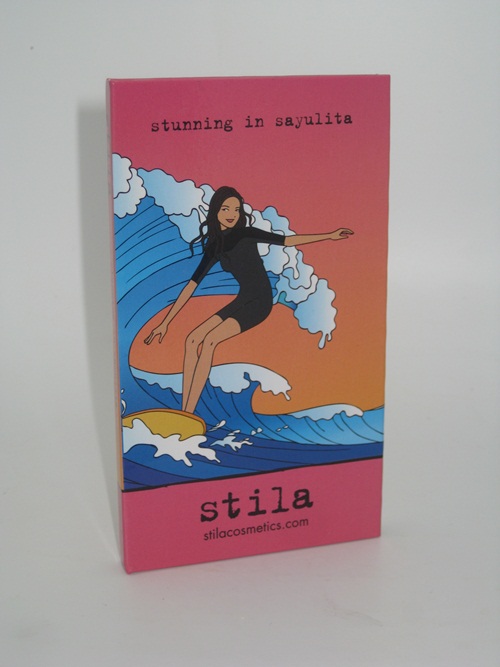
Overall, Stila’s new Beach Palettes are a win in the value department. I find I’m not minding the $4 price increase in the least since the formula has improved dramatically since their first attempt. I love the Stila Girls so it’s nice to see packaging that features them as I’m a sucker for cute makeup.
Stunning in Sayulita wasn’t a favorite by any means as I thought the shades had an issue with running into each other and becoming muddy easily however that could be my application techniques and heavier hand so I won’t take away my Muse Approval on these. The value is a good one particularly if you’ve wanted to indulge in Stila but can’t handle the higher price tag.


At the very least I can use all of these shades easily individually as they are all very pretty….together, well, not so much as I just lack the skill to make them work it seems!

I’m looking forward to the next palette’s release!
Have you tried this one yet?
Planning on ordering it?
Do share!

