February 11, 2013

Sephora + Pantone Universe Color Theory Shadow Block Review & Swatches

This was provided to me by a brand for review but all opinions expressed are my own

Sephora + Pantone Universe Color Theory Shadow Block Bionic

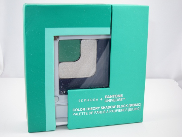
Sephora + Pantone teams up again this year to create the Emerald Capsule Collection which features a new Color Theory Shadow Block. The Color Theory Shadow Block embraces the Color of the Year, Emerald, with frosty white and navy blue to contrast.

Can you rock it?

I can’t…..

Seriously, I’d love to tell you that Emerald was a great Color of the Year pick for me but I’m actually still in lust with Tangerine from last year.

Created in a similiar style as last year’s collection this shadow block comes in a pale white compact. Packaging did get a slight chic upgrade with a new slide out mirror that’s located below the shadow. I love the packaging as not only is it geek chic simplicity but also happens to be easy to store, easy to travel with, and hell it just looks kinda brilliant.

Sephora + Pantone Universe Color Theory Shadow Block Palette

Sephora + Pantone Universe Color Theory Shadow Block Spring 2013

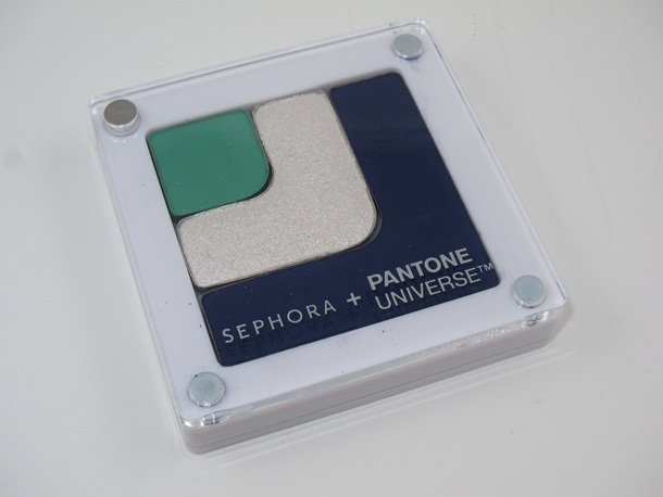
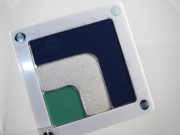
The Sephora + Pantone Universe Color Theory Shadow Block ($26) is somewhat ironic considering it is dominated by navy blue and a frosty white…and a little tiny bit of Emerald. Eh? Perhaps that’s just the way the palette is design and maybe each shade weights in at an equal amount but you’d think they’d want to make the Color of the Year a more prominent part of the palette.

At $26 it is a pricey little devil so you might want to skip it and just indulge in the The 2013 Color of the Year Emerald Collection which is $68 and includes this palette as well as several other full size pieces from the Emerald Capsule Collection.

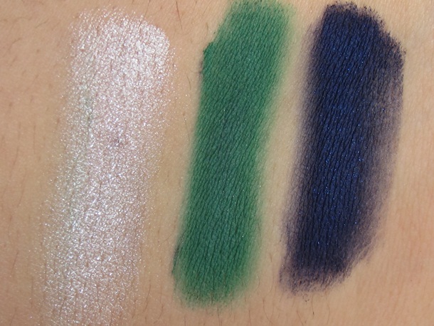
Aside from the frosty, yet shimmering white shade of shadow you’ll be working with heavily pigmented shades of matte shadow in this palette. Both the Emerald and deep navy blue are matte finishes. This could make them easier to wear and work with depending on your finish of choice vice. I’d personally prefer a sparkling shade of Emerald but that’s just my bag…yours could be mattes.

For a matte shadow they are saturated as a hell so a little goes a long way. The texture is powdery yet silky at the same time and easy to blend on lids without looking chalky or patchy. They have a surprisingly strong, quality formula for a matte. The white shade is a little sheerer but I suspect the want you to highlight with the color so little pigment is needed here.

Sephora + Pantone Universe Color Theory Shadow Block

Sephora + Pantone Universe Color Theory Shadow Block Swatches

Overall, it’s a pricey palette and unless you REALLY adore shades like this you might find it difficult and unfriendly to use and work with it. Not everyone is a master at using such bright, bold shades of mattes, I know I’m not. But if you can rock you’ll probably be quite pleased with the overall formula. Worst comes to worst you can use the shadows as dynamite eyeliners.

I dunno if you need it but it might be fun exploring it when it launches in March at Sephora.

What do you think?

Like it?

Naaaa?

Do share!

This was provided to me by a brand for review but all opinions expressed are my own

About the Muse

Isabella MuseIsabella is just an average everyday geeky girl who doesn’t blend her eyeshadow correctly, wears too much blush, and hopes she never finds her holy grail products because she likes the thrill of the chase so much. Her mission is to bring you super honest reviews on makeup, skincare, fragrance and all things beauty. She’s in no way an expert on the topic and she sure as hell isn’t a super model. But she’s passionate about makeup and is seeking like-minded individuals that like pina coladas, getting caught in the rain, and ones that enjoy spending hundreds of dollars at Sephora without feeling buyer’s remorse. If you’re that person feel free to reach out and leave a comment or follow me on Facebook, Instagram, Twitter, and Bloglovin‘.

Leave a Comment

This site uses Akismet to reduce spam. Learn how your comment data is processed.

Comments

  • Al

    I love how pigmented these are, but being the glitter/sparkle lover that I am, I’m a disappointed by all of the matte. I think I’ll pass on this.

    I have to say, nothing about this collection really wowed me. I LOVED last year’s tangerine collection.

  • dia

    I just realized this is the same color combo as my toothbrush. Minty fresh eyeballs? Hm. I think the silver and navy would make a nice, dramatic smokey eye together, but I can’t figure out how to work in the green. It seems to belong to a different occasion. It would make a fun crease color for an otherwise neutral day look.

  • Lauren

    Absolutely gorgeous! I’ll be passing on it, unfortunately, since my blending skills and confidence in wearing such bright colors are pretty much nil. Wish I could wear them, though, since they’d look killer with my coloration (fair with very dark hair and eyes).

  • Joanna

    Love the pigmentaion of the eyeshadows and especially that 2/3 are mattes. I would not mind the splurge at all 🙂

    Thank you for the awesome swatches:)

  • Majick

    Awe, I was waiting for an eye look. Maybe mixing the white with emerald you’d get the shimmer you like? I think the color payoff looks tremendous and the colors are very different than the norm.

  • Drea

    There is another palette with a frosty beige, a caramel/tan color and the green. Might be easier for most people to wear.

  • charlotte

    I can think of about a dozen other colors they could have paired with the green that would have been more flattering.. kind of an odd combo. Even just a palette with various shades, tones, and finishes of the green would be more appealing to me.

  • amy

    Pretty, but I know I would never use it… I just don’t wear this combination of colors, and I’m far too lazy to combine it with another palette. I do think the shades would be flattering on all skin tones, though (at least more so than last years Tangerine).

  • jenny jacobs

    While this looks so pretty (and thanks for the swatches!) I cannot pull off blues and greens. I’m extremely fair with blue eyes and red hair, and green and blues always make me look a little off. I stick to neutrals 🙂

  • Mermaid

    If the green was the large one and the blue was the mini, I would buy this. Sadly, it’s the other way around.